So you’ve created a lead magnet, recorded a webinar, or launched an online course. Now you get to promote it!
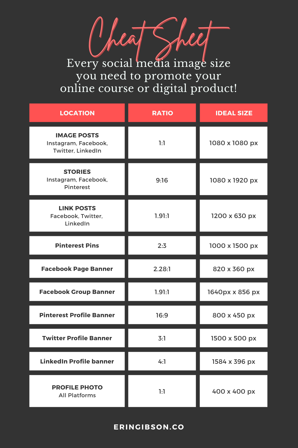
And that means creating a boatload of graphics to use in your social media posts. Annoyingly, social media platforms are constantly changing their recommended image sizes, and tracking them all down is a tedious endeavor. Never fear, I’ve done it for you! This is every social media image size you need for Instagram, Facebook, Pinterest, Twitter, and LinkedIn.
First, here’s the good news.
While this may look like an enormous pile of images that you need to create, you can save yourself a lot of time by using the same image across multiple platforms whenever possible. For instance, your posts on Instagram, Facebook, and LinkedIn can all use the same square images. The same is true with stories, which are the same size across Instagram, Facebook, and Pinterest.
This is not a complete list of every image size you could use on every platform. For instance, you can use taller, rectangular images on Instagram, Facebook, or Twitter if you really want to. But sticking to the image sizes below will keep things simple and ensure that you get as much utility as possible out of every graphic you create by allowing you to use the same image across several platforms.
Like I tell my clients: Spend less time creating a million different graphics and more time actually promoting your product!
How to read aspect ratio and image sizes:
For both aspect ratios and image sizes, the first number is the width and the second number is the height.
Let’s use the example of a Pinterest pin, with a 2:3 ratio and an ideal image size of 1000 x 1500 pixels:
- 2:3 ratio = 2 wide by 3 high. This image is two-thirds as wide as it is tall.
- 1000 x 1500 px = 1000 pixels wide by 1500 pixels high.
You can go larger if you maintain the same aspect ratio.
The image sizes below are the minimum recommended, but you can go larger as long as you maintain the same aspect ratio. For instance, the recommended size for a Pinterest pin is 1000 x 1500 pixels, but 2000 x 3000 pixels will work just as well because it’s still a 2:3 ratio. Here’s a handy ratio calculator.
Certain high-resolution displays—in particular, Apple’s retina displays—will display more than the standard number of pixels per inch (PPI). That means that one pixel on a normal display is equivalent to four pixels on a retina display. What does that mean for you? Only that your images may not look quite as crisp on a retina display. If you care about that, create your images at double the recommended size.
The only thing to look out for here is file size. This won’t be an issue on social media, as most platforms will simply shrink your image if they deem it larger than they prefer. But if you’re also going to be uploading these images to your website (most common with Pinterest pins) using an enormous image could make your site slower to load.
Now, onto the image sizes!

Image Sizes for Instagram:
- Instagram posts are a 1:1 ratio and the ideal image size is 1080 x 1080 pixels.
- Instagram stories are a 9:16 ratio and the ideal image size is 1080 x 1920 pixels.
Image Sizes for Facebook:
- Facebook image posts are flexible. You can use the same square images that you create for Instagram with a 1:1 ratio and image size of 1080 x 1080 pixels.
- Facebook stories are a 9:16 ratio with an ideal image size of 1080 x 1920 pixels.
- Facebook link posts—that’s when you create a post using a URL and let Facebook automatically pull in a preview image that you’ve set up on your website—are a 1.91:1 ratio with an ideal image size of 1200 x 630 pixels.
- Facebook group banners are a 1.91:1 ratio with an ideal image size of 1640 x 856 pixels.
- Facebook business page banners are a 2.28:1 ratio with an ideal image size of 820 x 360 pixels.*
*Make sure to test your Facebook business page banner on both desktop AND mobile! Always the difficult child, Facebook is constantly changing its image sizes and they’ve never quite landed on a layout for pages where the banner displays the same way on both desktop browsers and smartphones.
Their current iteration displays business page banners at 820 x 312 pixels on desktop and 640 x 360 pixels on mobile, thus I recommend an image that’s 820 x 360 pixels to cover the longest dimensions of both. This difference means that any content placed too close to the edges of your graphic may get cropped off on mobile, or vice versa.
Image Sizes for Pinterest:
- Pinterest pins are a 2:3 ratio with an ideal image size of 1000 x 1500 pixels.
- Pinterest stories (aka Idea Pins) are a 9:16 ratio with an ideal image size of 1080 x 1920 pixels.
- Pinterest profile banners are a 16:9 ratio with an ideal image size of 800 x 450 pixels.
Images Sizes for Twitter:
- Tweet images are flexible. You can use the same square images that you create for Instagram with a 1:1 ratio and image size of 1080 x 1080 pixels.
- Twitter link posts (aka Summary Cards) work like link posts on Facebook, with a 1.91:1 ratio and an ideal image size of 1200 x 630 pixels. (Twitter technically recommends a 2:1 ratio, but the difference is so minimal that you’ll be fine using the same 1.91:1 ratio here.)
- Twitter profile banners are a 3:1 ratio with an ideal image size of 1500 x 500 pixels.
Image Sizes for LinkedIn:
- LinkedIn image posts are flexible. You can use the same square images that you create for Instagram with a 1:1 ratio and image size of 1080 x 1080 pixels.
- LinkedIn link posts work like link posts on Facebook, with a 1.91:1 ratio and an ideal image size of 1200 x 630 pixels.
- Linkedin profile banners are a 4:1 ratio with an ideal image size of 1584 x 396 pixels.
Your Profile Image:
All of the major social media platforms use square profile images. It’s a good idea to use the same profile photo across all of the platforms you use. This keeps things consistent and makes it easy for people to tell that they’ve landed in the right place. For profile images, you should be safe using the same square image of at least 400 x 400 pixels across all platforms.
Whenever possible, use a photo of your smiling face, not a logo. People want to know that they’re following a human rather than a faceless company! If you are actually a company that does not have an individual leader, a logo is fine!


